Welcome to our A2 Media Studies project - creating a promotional package for a new film. '10-'11

Friday, 4 March 2011

1. In what ways does your media product use, develop or challenge forms and conventions of real media products?

POSTER
For our poster we experimented with various layouts before choosing our final image. We debated on whether we should portray our main protagonist as the victim or as the villain. The villainous images had more conventions of horror, but we found that by using an image of her inside the coffin it created a more definite link with our trailer narrative.

When designing the layout of our poster we applied the theory of “the golden section”. We placed the image of our victimised protagonist on the right side of the poster. According to “the golden section” this satisfies the viewer’s eye line and makes them engage with both the text and the image.

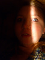
We used an extreme close up of our protagonist and a completely black background to induce the sense of claustrophobia, thus linking with our trailer narrative. The dark background makes the viewer focus on the beam of light that centres down the character’s face. The light is positioned on “the golden section” and draws the attention of viewers.
For our typography we decided to get creative and design the title of our film with an art focussed twist. We wanted to develop our title from the conventional style of horror typography. We therefore converted the “Y” from our title “Abyss” to represent a tree. The symbol of the tree satisfies our trailer narrative and makes the title of our film more distinct and recognisable. Our typography idea was inspired from our research into Tim Burton’s unique film titles.


WEBSITE
We chose to create a website rather than a magazine cover because of the increase of society transferring online. In doing this, it is likely to be more accessible to fans due to the websites becoming increasingly favoured over magazines.

We used a simple black background on the introduction page with a single image in the centre to focus the viewer’s eye. The use of red typography, white light on the picture and black background connotes a conventional gothic feel and clearly portrays a horror film. We wanted our website to be user friendly and easy to navigate, therefore we did not challenge the conventions of a website. This meant that users could comfortably navigate the site by presenting them with what they would expect from a film website. By not challenging the conventions of film websites we also created consistent branding by using the same logo and similar typography throughout. This allowed our target audience to recognise and associate this logo with our three media products.

We used the layout and design, particularly of our links, to induce a sense of claustrophobia, which directly relates to the concept of our narrative. The constant references to our narrative throughout our media products conform to the conventions of real media products.

 After researching promotional websites for films we found that having the trailer play automatically on the home page frequently occurred. This would allow new visitors to view the trailer instantly, which we feel is good promotion as we aimed for the black screen and the non diegetic sound at beginning of our teaser trailer to be the most memorable and intriguing part.

We also have links on every page of the website to an interview and gallery of pictures from filming. We have these links because it gives fans and visitors to the page an insight to the behind the scenes aspect, which will make them feel more involved and therefore valued. We created and uploaded the blooper reel to our website in order to create this same feeling among fans.


TEASER TRAILER
Before production of our teaser trailer we made sure we knew all the conventions for teaser trailers from real media products. This research was significantly useful because it gave us guidelines for our editing - creating anchorage, generating backing sound and constructing the whole trailer in an appropriate 1 minute.

We further researched into codes and conventions of general horror films, so that we satisfied our target audience. We found that the use of diegetic sound is crucial in making a horror because it makes the horror seem more realistic and relatable. We thought that its use would be particularly relevant for our teaser trailer because we wanted to create a sense of claustrophobia. To do this we also used the conventional black screen. The black screen removes all visuals so that the audience have to focus on the sound. By using both a black screen and diegetic sound we feel we achieved a sense of claustrophobia and terror. We extended this idea further and decided to introduce our teaser trailer narrative with just sound. The diegetic sound of dirt and digging supports our narrative and induces intrigue and mystery.


For the coffin scenes we examined films and television shows, including “Kill Bill”, the TV drama “Misfits” and the recently released “Buried”. From this research we were able to construct our own “coffin” with the exact angles we wanted to film from. The research also helped us when making lighting decisions. We explored many ideas including the use of a torch, a phone and iPod, but found when filming that the objects became awkward. It also made us have less control over the amount of light and shadows. We therefore settled on illuminating the coffin ourselves. We used a desktop light with a red tea towel over it, creating a red glow, to give connotations of danger, urgency and heat.

Propp’s theory on characters taking on roles of narrative or “spheres of action” deeply influenced our work. We began our narrative by conforming to Propp’s theory by introducing our victim and protagonist as a helpless teenage girl. We therefore chose an actress who had blonde hair and who could act the victim. However we developed this character by transforming her into a potential villain by the end of our teaser trailer, thus subverting Propp’s theory of traditional character roles. This linked with Levi-Strauss’ theory of binary opposition. We set up our narrative by implying the villain to be a middle aged male, but then subverted these expectations. This idea originated from our research on Friedrich Nietzsche. His theory stated that there is a dual recognition from the audience between both the villain and the heroic protagonist. Freudians also state that horror villains satisfy our “return of the repressed”. We decided to end our trailer on the transformation as a cliff hanger to entice viewers. The fact that it ends with a supernatural twist we feel adds another layer to our psychological horror.

Researching into theories in pre-production proved very useful. We subverted Todorov’s theory of equilibrium by beginning our trailer with the sense of disequilibrium. For research we created graphs of successful trailer narratives such as “Inception” and compared them with a graph of Todorov’s conventional narrative. To create a sense of disequilibrium we just used diegetic sound as our opening narrative and installed mystery by using quick edited close up shots. We continued the theme of disequilibrium throughout our teaser trailer by also manipulating the sense of time in the narrative. We used devices such as flash forwarding and repetition, for example in one of the shots we reversed and sped up our actress crawling up the hill, inducing a possible forking path narrative.

We also studied Sid Field’s theory of a three stage narrative for typical Hollywood films. Due to the conventions that make up a good teaser trailer, we only used “the setup” and “the confrontation” stages of his theory. Including “the resolution” would undermine the aim of a teaser trailer to literally “tease” and not spoil the outcome.

Another typical theme of horror is isolation, which has a definite link with our chosen sub-genre of psychological horror. We decided that we wanted to push the boundaries and explore notions of extreme isolation. This prompted us to think of the most primitive fear of being buried alive. The incident in October with the Chilean Miners being trapped underground made our choice of topic very up to date, and the release of “Buried” and Danni Boyle’s incredibly recent “127 hours” proves that it is still a very current topic of discussion. Due to this we wanted to focus on mainly of the notion of being trapped, therefore the major scene in our teaser trailer is of the main protagonist in the coffin. To support our theme of being buried alive we kept referring to visuals of dirt throughout our teaser trailer. For example, we used clips of the protagonist crawling up a slope, a worm tunnelling into the earth and bugs crawling in mud.

To support and develop this extended metaphor we also changed the colouring of clips to warm oranges and browns in post-production editing. We did this to induce the feeling of uncomfortable heat and to harmonise with the red light shots in the coffin.

We also used a white torch light in the dark and changed the contrast to create an opposing cold effect to the end shots to signify death and therefore the loss of her heart and feelings, such as guilt, allowing her to seek revenge without her conscience.


To keep our narrative open to interpretations we allowed for anachronic modular narratives. Ideas surrounding modular narratives were put forward by Allan Cameron. He explained that modular narratives “articulate a sense of time as divisible and subject to manipulation.” We created enigmas by repeating scenes from other characters perspectives and flashing forward to establish possible outcomes. For example we juxtaposed scenes with our victim inside the coffin to the villain filling in the grave. This technique helped to move our narrative into supernatural horror. It also helped to satisfy teaser trailer conventions of fast paced editing.

The narrative research for our A2 coursework played a major role in influencing our creative decisions. By studying narrative we were able to confirm our horror genre through teaser trailer conventions.

Thursday, 3 March 2011

2. How effective is the combination of your main product and ancillary texts?

TYPOGRAPHY
To make the title of our film instantly recognizable for potential audiences we used the same typography for all our main product and ancillary texts. The fact that we put a creative twist on our title (turning the "Y" in "Abyss" to a tree design) helped to sustain a definite link with our narrative and horror genre. We transformed this "Y" to resemble a tree to reflect the tree in our trailer, which is naturally in the shape of a "Y" (although this is difficult to interpret in the quick flash shot used). It is in this shot that we show a glimpse of the villain, so we made sure to film it in the fog then enhanced it in post production to make the villain more sinister since it was only a short clip. The grey, dull colouring of this clip links with the background of the pages in the website. These are also of a dull, greyish colour so the visitor is not distracted by the background when visiting
the page- they are able to focus on the main feature of the screen.

We also used the same downloaded font for our poster, website and trailer tag lines in order to provide them with a direct connection. This font has a gothic feel which we feel typically represents the horror genre and successfully reflects our narrative.

REFLECTION OF NARRATIVE 
We made sure that we maintained a strong link with our narrative through our chosen images. Our narrative was important to us because no only did it reflect current events (the Chilean Miners incident), but it also subverted some typical stereotypical views of females in films. We subverted the view that women are weak and rely on men by having our teenage girl protagonist becoming more masculine and aggressive at the end of our trailer rather than conforming to the stereotype and waiting for a 'prince' to rescue her. We also reflected this in our website with the front page image being of her at the end of the trailer, thus showing her to be independent and assertive by having her look directly into the camera in the photo.
Our mise en scene in the trailer reflects the Chilean Miners because we created a 'coffin' environment as the main focus and our narrative was predominately the victim trapped in the coffin, underground. This theme is continued in our poster, with the image being mostly black (representing the darkness underground) with a slit of light revealing the victim's face and showing that she is trapped- which is why we chose to use a slit of light created by shining a light through the 'coffin' lid, rather than fully lighting her face. This bar of light also implies a sense of claustrophobia and entrapment.
We kept the same typical colouring and lighting of the horror genre throughout our products to ensure the recognition of the continuity of the psychological horror genre among the audience. For example we kept the background dark and contrasted the colours to make the introduction page dramatic and intriguing.


POSTER AND TRAILER
When creating our first ancillary task, the poster, we wanted to ensure it reflected a typical horror poster whilst relating to our narrative. We therefore created designs based on our research of other posters, such as The Blair Witch Project and Buried posters and took pictures that we could use in our poster. We like the idea of the treetops in the Blair Witch poster but also the image of the protagonist in the coffin in the Buried poster.

We therefore took photos of treetops and our actress in the 'coffin' in the hope that we could create a combination of these posters which we felt would best reflect our narrative- the audience would be able to correctly categorise it as a horror from the treetop silhouette and realise the narrative is based on being trapped, indicating a psychological horror. However, these photos did not work out as hoped, with the treetops being taken from the wrong angle so showed too much of the tree and not enough black for the coffin picture to sit in and the coffin picture was too light to be toned down effectively using SerifDrawPlus8. Additionally, we felt our actress was posed in too much of a 'model' position rather than being buried so, as good as these pictures were on their own, they could not be used together in our poster. So we tried a different design of mostly black with a slit of light shining on the face of our protagonist. Although we did not draw this design up in a rough copy on paper like the other designs, we discussed it and arranged another photo shoot of our actress in the coffin in order to obtain the necessary shots to use for our poster. To get the slit of light across her face, we moved the desktop lamp used during filming and shone it over the lid of the coffin. We found this produced the desired line of light so, when we had a range, we uploaded the photos and set about darkening them and enhancing the contrast. We did this so less of her face would be revealed, closer relating the poster to the horror genre as black is typically the dominant colour. After some final rearranging of the writing and font colour, we were satisfied that our final poster design effectively reflected both our narrative and chosen genre. 

WEBSITE AND TRAILER
As with creating the design for our poster, we also wanted the design of our website to reflect some typical aspects of horror genre websites. We therefore researched into some such as Pan's Labyrinth, Misfits, The Ring and, again, Buried. Despite not all being specifically horror, we found the designs useful in influencing our own as they all related in a way- Buried and Misfits featured coffins and Pan's Labyrinth was bizare and, we felt, reflected a psychological horror to an extent.

We decided to take influence from all of these websites and created some potential designs. We wanted to have our links in a shrinking size pattern in the middle of the page, so that they appeared to be falling into the ground. We felt this would have perfectly reflected the 'buried' aspect of our narrative by visually reflecting the idea of sinking into the ground. However, when attempting to create this design we found it too difficult to arrange the links in such a pattern, so we went back to discussing designs. Again, as with the poster, we did not draw up the final design for the website because we were discussing as we made it, so immediately edited the design. Eventually, through all our research of typical websites and what aspects people liked and didn't like on film websites, we completed the design.

However, there were a few things left to change after we thought we had completed it. Despite our research showing that the majority of people did not like the trailer to play immediately, we were advised
to have it do so. We were also advised to remove the introduction page and change our links from images to words so as not to confuse visitors. It was a slight challenge to find a font to reflect our narrative, but
after a lot of searching we found a good match. After these changes were made, we agreed it was complete and effectively reflected both our narrative and psychological horror genre, as did the poster.

 
Left: links as images
Right: links as writing
Below: trailer on front page


Wednesday, 2 March 2011

3. What have you learned through audience feedback?

RESEARCH
Before creating our teaser trailer, we conducted research among our target audience to find out what they look for in a teaser trailer and which aspects of it encourage them to then watch the film in order to make the best trailer possible to attract our target audience, so it was very important in determining aspects of our trailer. We conducted this research in various ways, predominately through the use of the website SurveyPirate (the link for which we e-mailed) and a poll on the blog. Despite not being as popular as SurveyPirate, the poll showed everyone who took part preferred an anonymous villain in a trailer, so we made sure to not expose the villain much. We only used very distant shots or extreme close ups, so the audience could only determine the villain as a male adult through the signs and codes we provided. For example the close up shot of the villain's dirty boots signified him as a dominant, powerful male. The SurveyPirate results were of more use because they were more concise and more detailed. They provided direct responses from those who completed the survey through comments and showed for example, that the majority preferred a teenage girl as a protagonist because she would be more vulnerable (stereotypically) which would add to the suspense of the trailer, so we conformed to this to start with by having her trapped but then subverted this by having her become strong and independent in order to express our views of how females should be presented in the media more often.

RESULT
We were able to see how effective the application of the research results were in our trailer in the screening at school, which showed all the A2 teaser trailers to AS and A2 media students. The AS students (who acted as mutual critics) were asked to fill out a feedback form, which was then returned to the creators of the trailers so each group received feedback for their individual trailers.
The feedback for our trailer was generally positive- almost all of them recognised it as a horror, although not many said it was a psychological horror. This showed us that although we successfully applied the results of our research, it was necessary to have more 'psychological' shots to confirm the genre. To do this we could have focused more on the theme of madness and visual distortion.
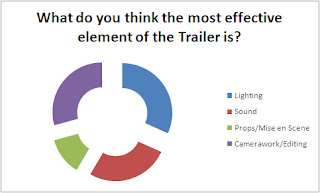
Most of the anonymous feedback forms liked lighting the most, which was encouraging because we paid particular attention to lighting in post production. Many also liked the sound and camerawork/ editing which we were also pleased with because we focused a lot on diegetic sound and experimented more with editing.
This feedback session showed us that we successfully applied our research to our trailer, so there were only a few aspects that could have been altered- such as the psychological aspect. For this we could have experimented more with editing by using time lapses and flash forwarding. We should have perhaps also studied films more directly related to the psychological, such as "Shutter Island" and focused more on character development to install a more definite link with madness.

Tuesday, 1 March 2011

4. How did you use new media technologies in the construction and research, planning and evaluation stages?

CONSTRUCTION
Within our teaser trailer, we used new media technologies throughout. At AS, we used iMovieHD on the MACs to create our film openings whereas at A2, we had the opportunity to use the new and updated iMovie instead.


(Left: iMovieHD, right: iMovie)

We found iMovie very different from iMovieHD because it has many new features, such as the option to stabilise a clip which we found useful. It was also easier to use than iMovieHD because despite having more features, it was of a simpler design which also meant we were able to achieve desired effects quicker because we didn't have to search for them and decipher how to apply them.

In our teaser trailer we decided to focus more on diegetic sounds, such as digging and screaming, because it was both more challenging and, if successful, more effective than using non-diegetic sounds and music. In order to focus the audiences' attention on the diegetic sound, we opened with a black screen with digging sounds and shot close up digging sounds separately so that they were clear when layered over the black and the digging clip, which was easy to do in the new iMovie.
In the coffin scenes, we used a desktop lamp covered in a red tea towel to create a red glow within the box. As well as lighting the coffin, this glow connotes danger and heat which reflects our narrative. We emphasised this effect in editing, changing the hues of the clips to the desired shade with the colour wheel in iMovie. The coffin was also used to frame our actress, which we enhanced in post production by adding an effect which added a shade to the edge of the clip so the audience focused on the actress.
Another main effect we used on iMovie was the speed and direction options.


We found these easier to use than on iMovieHD because we could select how much of the clip we wanted to change and could specify how fast or slow to make it. Therefore, we chose to speed up shots to reflect the panic and confusion of the character in the coffin and sped up the shots of the bugs to make them more unnatural to match our narrative. We also reversed our actress 'being dragged' down the hill, so she appeared to crawl up the hill. We then sped it up to make it more unnatural.

We were also introduced to the program Serif Draw Plus, which we used to create our poster and typography. We found this program quite complicated at first, but after some practise it became easier to use and we were able to create our ideal poster design, with the use the program's special layering and transparency options.
We also found this program useful when creating our typography, which we chose to do so that it suited and reflected our narrative, which wouldn't have worked as well if we had used a pre-made font from online. In creating our own, we were able to make the "Y" in "Abyss" look like the tree that was featured in our trailer, thus directly linking and reflecting it.


Finally, we used Garageband to create the backing music for our trailer.


Despite using this program last year, we had to work out how to get the most out of it because last year, the other member of our group (who did A-Level music) had the main input in regards to the music in the opening, but she left so we had to deepen our understanding of Garageband in order to get similar quality results for our music.


RESEARCH
Our main form of research was questionnaires, which we e-mailed throughout the school, posted online (on SurveyPirate) and put on our blog in the form of a poll.


We used these results to influence our trailer so that it would appeal to the right audience and have the desires effect.
We also researched the conventions of teaser trailers by watching and analysing then both online and on the television or in the cinema. We then applied the conventions we noted to our own trailer.


PLANNING
When planning our teaser trailer we used all the technology available to us to make a smooth transition from our ideas to filming and editing.


We therefore transformed our storyboard into a video of images to make sure our timing fulfilled teaser trailer conventions, and so that we had a clear goal to our end media product.

EVALUATION
To achieve a valid evaluation we used technological convergence to make our teaser trailer available to be commented upon and evaluated. We set up a YouTube account to showcase our trailer and receive comments, which we also linked to our media group's Facebook page. This use of technology enabled us to get critical feedback from the public, so we could evaluate our work effectually.


Final Abyss website


Tuesday, 18 January 2011

Tuesday, 11 January 2011

Thursday, 6 January 2011

Final Poster

This is our final poster, designed using Serif DrawPlus 8. It is a variant of our original mid-shot poster idea, as the image was taken spontaneously during our auxilliary task photoshoot. We have paid close attention to using the Golden Section rule within the design, and have used the same Abyss logo that is used in our Teaser Trailer and Website. The orange/red skin tone we have given our actress reflects the orange/red tones throughout the Trailer.