To make the title of our film instantly recognizable for potential audiences we used the same typography for all our main product and ancillary texts. The fact that we put a creative twist on our title (turning the "Y" in "Abyss" to a tree design) helped to sustain a definite link with our narrative and horror genre. We transformed this "Y" to resemble a tree to reflect the tree in our trailer, which is naturally in the shape of a "Y" (although this is difficult to interpret in the quick flash shot used). It is in this shot that we show a glimpse of the villain, so we made sure to film it in the fog then enhanced it in post production to make the villain more sinister since it was only a short clip. The grey, dull colouring of this clip links with the background of the pages in the website. These are also of a dull, greyish colour so the visitor is not distracted by the background when visiting
the page- they are able to focus on the main feature of the screen.
We also used the same downloaded font for our poster, website and trailer tag lines in order to provide them with a direct connection. This font has a gothic feel which we feel typically represents the horror genre and successfully reflects our narrative.
REFLECTION OF NARRATIVE
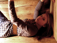
We made sure that we maintained a strong link with our narrative through our chosen images. Our narrative was important to us because no only did it reflect current events (the Chilean Miners incident), but it also subverted some typical stereotypical views of females in films. We subverted the view that women are weak and rely on men by having our teenage girl protagonist becoming more masculine and aggressive at the end of our trailer rather than conforming to the stereotype and waiting for a 'prince' to rescue her. We also reflected this in our website with the front page image being of her at the end of the trailer, thus showing her to be independent and assertive by having her look directly into the camera in the photo.
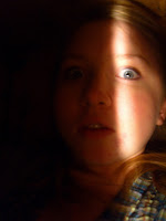
Our mise en scene in the trailer reflects the Chilean Miners because we created a 'coffin' environment as the main focus and our narrative was predominately the victim trapped in the coffin, underground. This theme is continued in our poster, with the image being mostly black (representing the darkness underground) with a slit of light revealing the victim's face and showing that she is trapped- which is why we chose to use a slit of light created by shining a light through the 'coffin' lid, rather than fully lighting her face. This bar of light also implies a sense of claustrophobia and entrapment.
We kept the same typical colouring and lighting of the horror genre throughout our products to ensure the recognition of the continuity of the psychological horror genre among the audience. For example we kept the background dark and contrasted the colours to make the introduction page dramatic and intriguing.
POSTER AND TRAILER
When creating our first ancillary task, the poster, we wanted to ensure it reflected a typical horror poster whilst relating to our narrative. We therefore created designs based on our research of other posters, such as The Blair Witch Project and Buried posters and took pictures that we could use in our poster. We like the idea of the treetops in the Blair Witch poster but also the image of the protagonist in the coffin in the Buried poster.
 We therefore took photos of treetops and our actress in the 'coffin' in the hope that we could create a combination of these posters which we felt would best reflect our narrative- the audience would be able to correctly categorise it as a horror from the treetop silhouette and realise the narrative is based on being trapped, indicating a psychological horror. However, these photos did not work out as hoped, with the treetops being taken from the wrong angle so showed too much of the tree and not enough black for the coffin picture to sit in and the
 coffin picture was too light to be toned down effectively using SerifDrawPlus8. Additionally, we felt our actress was posed in too much of a 'model' position rather than being buried so, as good as these pictures were on their own, they could not be used together in
  our poster. So we tried a different design of mostly black with a slit of light shining on the face of our protagonist. Although we did not draw this design up in a rough copy on paper like the other designs, we discussed it and arranged another photo shoot of our actress in the coffin in order to obtain the necessary shots to use for our poster. To get the slit of light across her face, we moved the desktop lamp used during filming and shone it over the lid of the coffin. We found this produced the desired line of light so, when we had a range, we uploaded the photos and set about darkening them and enhancing the contrast. We did this so less of her face would be revealed, closer relating the poster to the horror genre as black is typically the dominant colour. After some final rearranging of the writing and font colour, we were satisfied that our final poster design effectively reflected both our narrative and chosen genre.
 WEBSITE AND TRAILER
As with creating the design for our poster, we also wanted the design of our website to reflect some typical aspects of horror genre websites. We therefore researched into some such as Pan's Labyrinth, Misfits, The Ring and, again, Buried. Despite not all being specifically horror, we found the designs useful in influencing our own as they all related in a way- Buried and Misfits featured coffins and Pan's Labyrinth was bizare and, we felt, reflected a psychological horror to an extent.
We decided to take influence from all of these websites and created some potential designs. We wanted to have our links in a shrinking size pattern in the middle of the page, so that they appeared to be falling into the ground. We felt this would have perfectly reflected the 'buried' aspect of our narrative by visually reflecting the idea of sinking into the ground. However, when attempting to create this design we found it too difficult to arrange the links in such a pattern, so we went back to discussing designs. Again, as with the poster, we did not draw up the final design for the website because we were discussing as we made it, so immediately edited the design. Eventually, through all our research of typical websites and what aspects people liked and didn't like on film websites, we completed the design.
However, there were a few things left to change after we thought we had completed it. Despite our research showing that the majority of people did not like the trailer to play immediately, we were advised
to have it do so. We were also advised to remove the introduction page and change our links from images to words so as not to confuse visitors. It was a slight challenge to find a font to reflect our narrative, but


No comments:
Post a Comment